Throw back a couple of years to a little animation I created based on one of my poster designs…
Author: Amsterdane
An artist logo
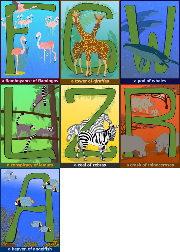
graphicsFirst 7 collective nouns ready
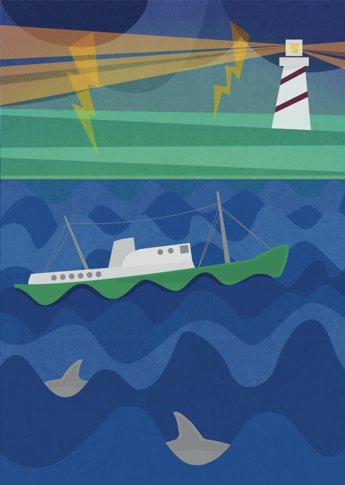
Collective nouns, English, graphicsCalm sailing and rough seas
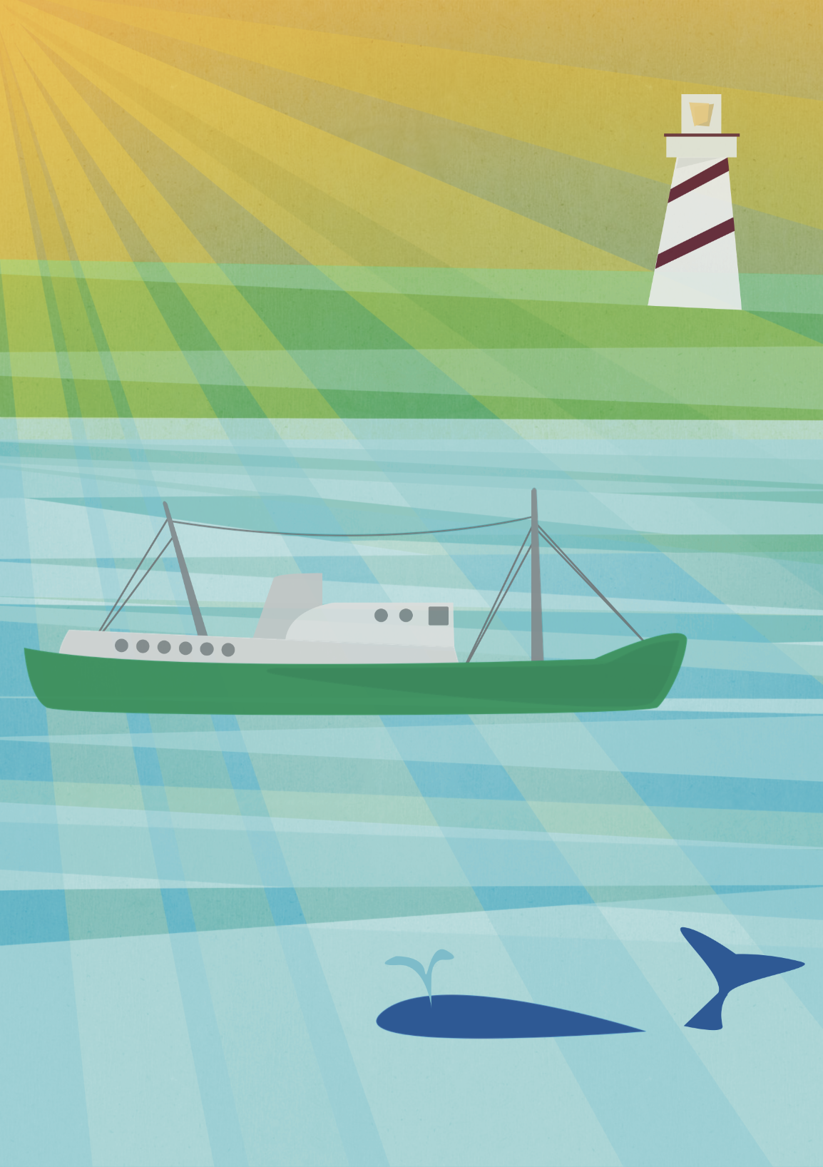
English, graphics, PrintI designed a series of posters to metaphorically reflect different situations a organisation has to navigate in. The two below represent calm sailing and rough seas. The posters were printed in A0 format, and displayed at a global meeting, where the facilitator used them as discussion points during the conference.
Icon set for website
graphics, Interactive, Web![]()
For a client I created the colour scheme and icons for a section of their website. The icons are represented in a variety of colours and in a ’rounded’ and flat square format. Together with other graphic elements created they provide a coherent messaging and navigation across a range of topics on the site.
![]()
Brewing up a storm
graphics, Print
Together with two friends I have spend the last couple of years perfecting home brewing – it’s been a road filled with lots of tasty brews (and a few set-backs). Though this is a fun hobby project, I have played around with developing a visual style for our micro-micro-brewery. This is still a work in progress, but I have attached some early sketches and thoughts below.
PS. The 3 Ganders name comes from the alley we brew next to and the number of budding brewers involved.


Logo and branding for client Instagram account
graphics, Print, WebCreating a basic round logo for an Instagram account promoting flea market finds in Denmark. I wanted to stay with a slightly vintage feel to stay true to the accounts theme, though still making it look fairly modern.

Another Lego blast from the past
English, UncategorizedOne of the more interesting projects I worked on at Lego, was the creation of a scale model of the then newly released Agila to be displayed in Opel show rooms . The car had detailed features inside and out, and measured well over a meter in length. Apologies for the poor image quality.

‘Model kit’ iconography
English, graphics, UncategorizedFor a global organisation, I was commissioned to assist with a number of graphic elements for a presentation and a series of electronic documents. Together the documents comprised a model, that could be amended to suit local needs.
In order to illustrate this, I designed a ‘model kit’ comprised of icons, that each represented different elements of the model. Each document had the icon as a clear visual marker back to the model.

The final part of the assignment was formatting and aligning the various documents to present a uniform appearance of the entire model.
Summer hand-out
graphics
In co-operation with a graphic designer, created and distributed 33.000 postcards containing vintage style baggage labels. The labels where die-cut, and could be attached to bags using an elastic band or a piece of string.

The imagery and feel of the hand-outs were re-used in a number of Facebook ads targeting specific groups with an interest in travel.


