created some suggestions for a logo to match the feel of the clients pages

Loved the logo so much I chose a version to create a new tattoo.

created some suggestions for a logo to match the feel of the clients pages
Loved the logo so much I chose a version to create a new tattoo.
Still working through the alphabet on this one – suggestions on a postcard please.
Interestingly flamingoes/flamingos can be spelled both ways any thoughts…
I designed a series of posters to metaphorically reflect different situations a organisation has to navigate in. The two below represent calm sailing and rough seas. The posters were printed in A0 format, and displayed at a global meeting, where the facilitator used them as discussion points during the conference.
![]()
For a client I created the colour scheme and icons for a section of their website. The icons are represented in a variety of colours and in a ’rounded’ and flat square format. Together with other graphic elements created they provide a coherent messaging and navigation across a range of topics on the site.
![]()

Together with two friends I have spend the last couple of years perfecting home brewing – it’s been a road filled with lots of tasty brews (and a few set-backs). Though this is a fun hobby project, I have played around with developing a visual style for our micro-micro-brewery. This is still a work in progress, but I have attached some early sketches and thoughts below.
PS. The 3 Ganders name comes from the alley we brew next to and the number of budding brewers involved.


Creating a basic round logo for an Instagram account promoting flea market finds in Denmark. I wanted to stay with a slightly vintage feel to stay true to the accounts theme, though still making it look fairly modern.

For a global organisation, I was commissioned to assist with a number of graphic elements for a presentation and a series of electronic documents. Together the documents comprised a model, that could be amended to suit local needs.
In order to illustrate this, I designed a ‘model kit’ comprised of icons, that each represented different elements of the model. Each document had the icon as a clear visual marker back to the model.
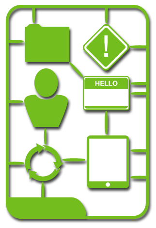
The final part of the assignment was formatting and aligning the various documents to present a uniform appearance of the entire model.

In co-operation with a graphic designer, created and distributed 33.000 postcards containing vintage style baggage labels. The labels where die-cut, and could be attached to bags using an elastic band or a piece of string.

The imagery and feel of the hand-outs were re-used in a number of Facebook ads targeting specific groups with an interest in travel.

The brief was to develop a simple new cover for the Danish Board of Technology whilst maintaining all the existing elements. In the illustration you can see the process from original through several iterations, and finally the submitted design proposal. I found it important to play with the meaning of ‘World Wide Views’ and combine this with the topic of climate and energy, while staying close to the original (somewhat generic) logo for the project.

I was asked to do the lay-out for a competition poster for one of the student associations at Aalborg University Copenhagen. A fairly straight forward brief, but still fun to play around with the elements and colours.